CLIENT : IBIZENKO KÖLN, GERMANY
CHALLENGE
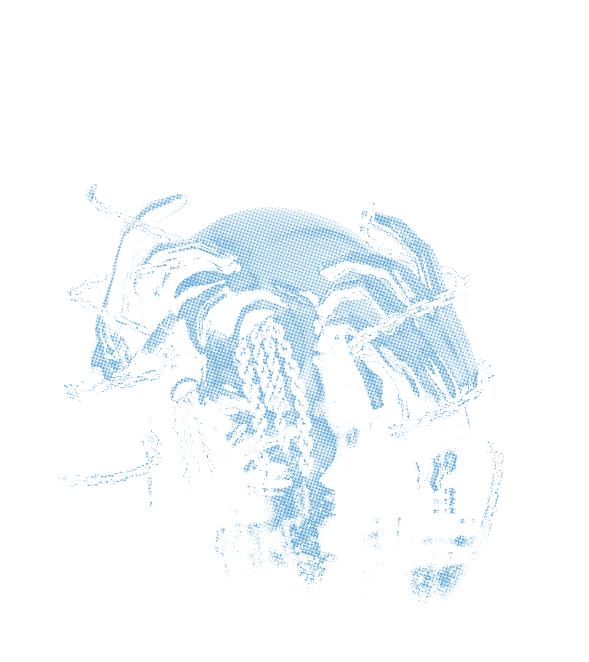
The brand had not released any clothing for over a year and wanted to attack again with a small rebranding and aggressive, eye-catching designs.
This definition of illusion was the guiding principle for the collection
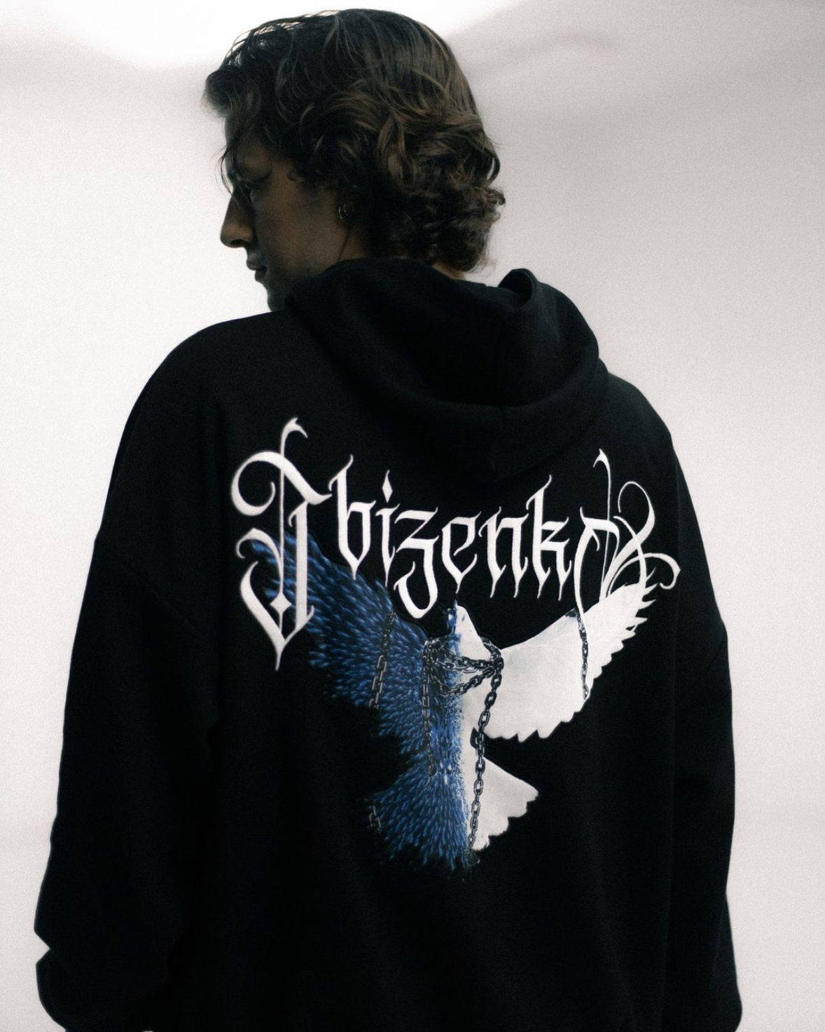
As it was also a kind of rebranding, we tried not to find completely new approaches. Instead, we tried to retain part of the old corporate identity
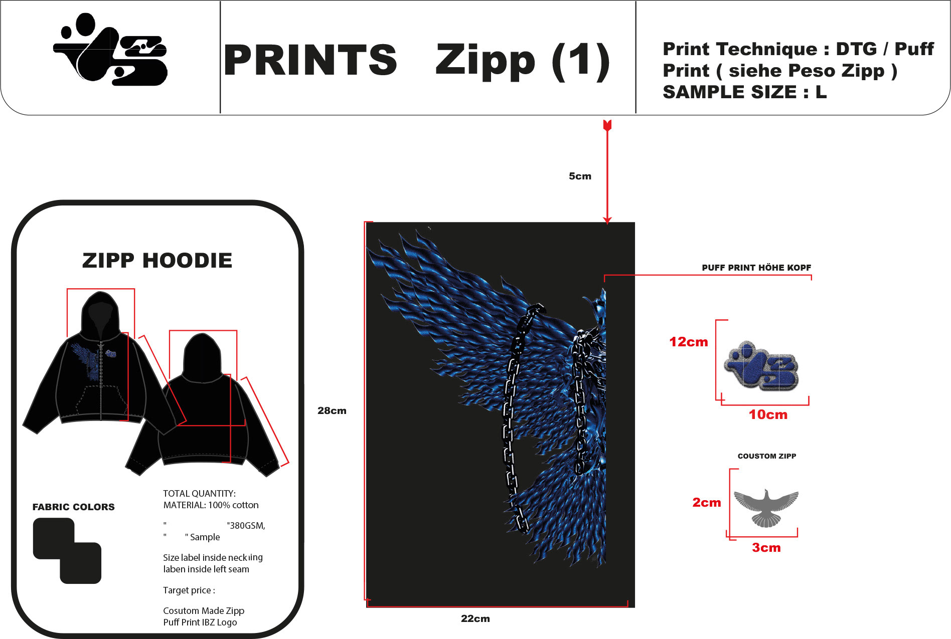
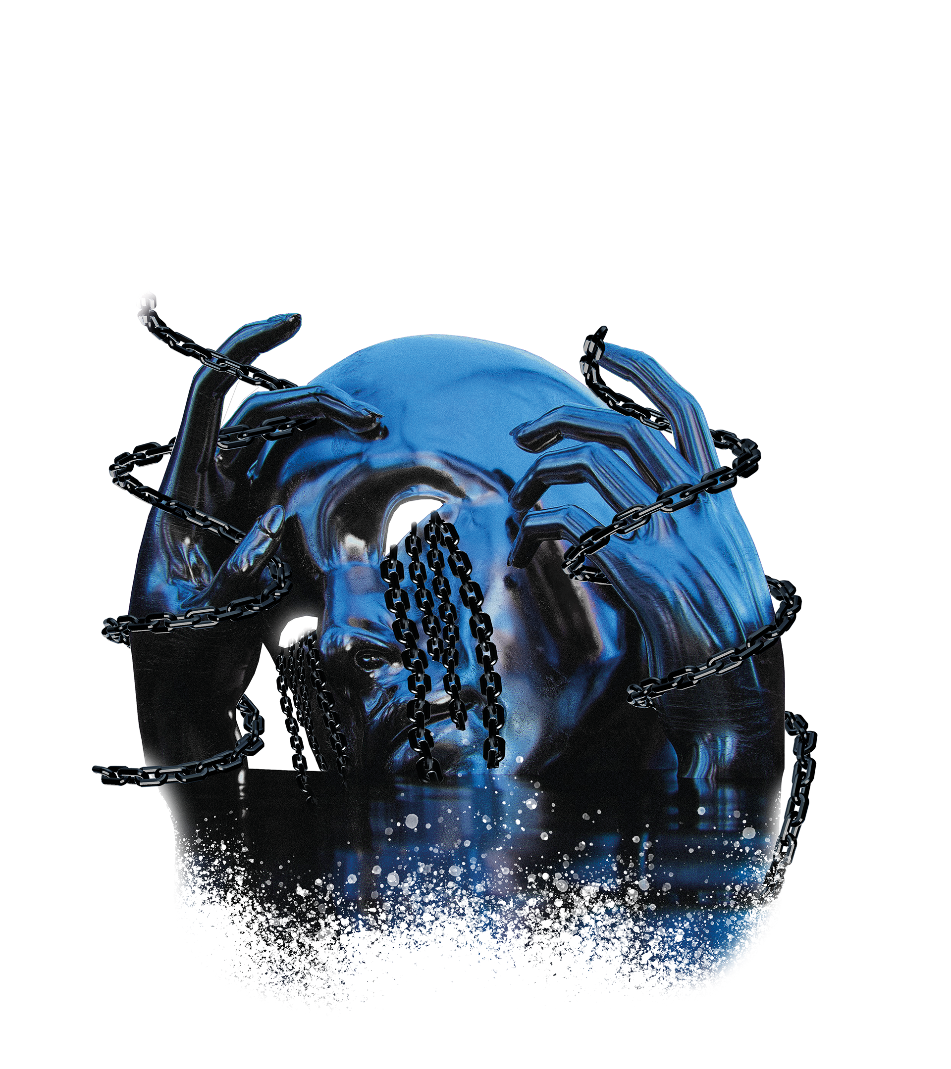
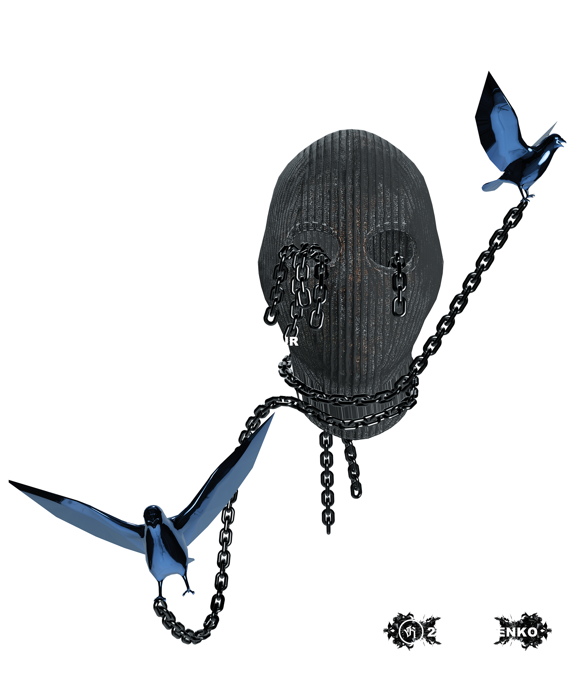
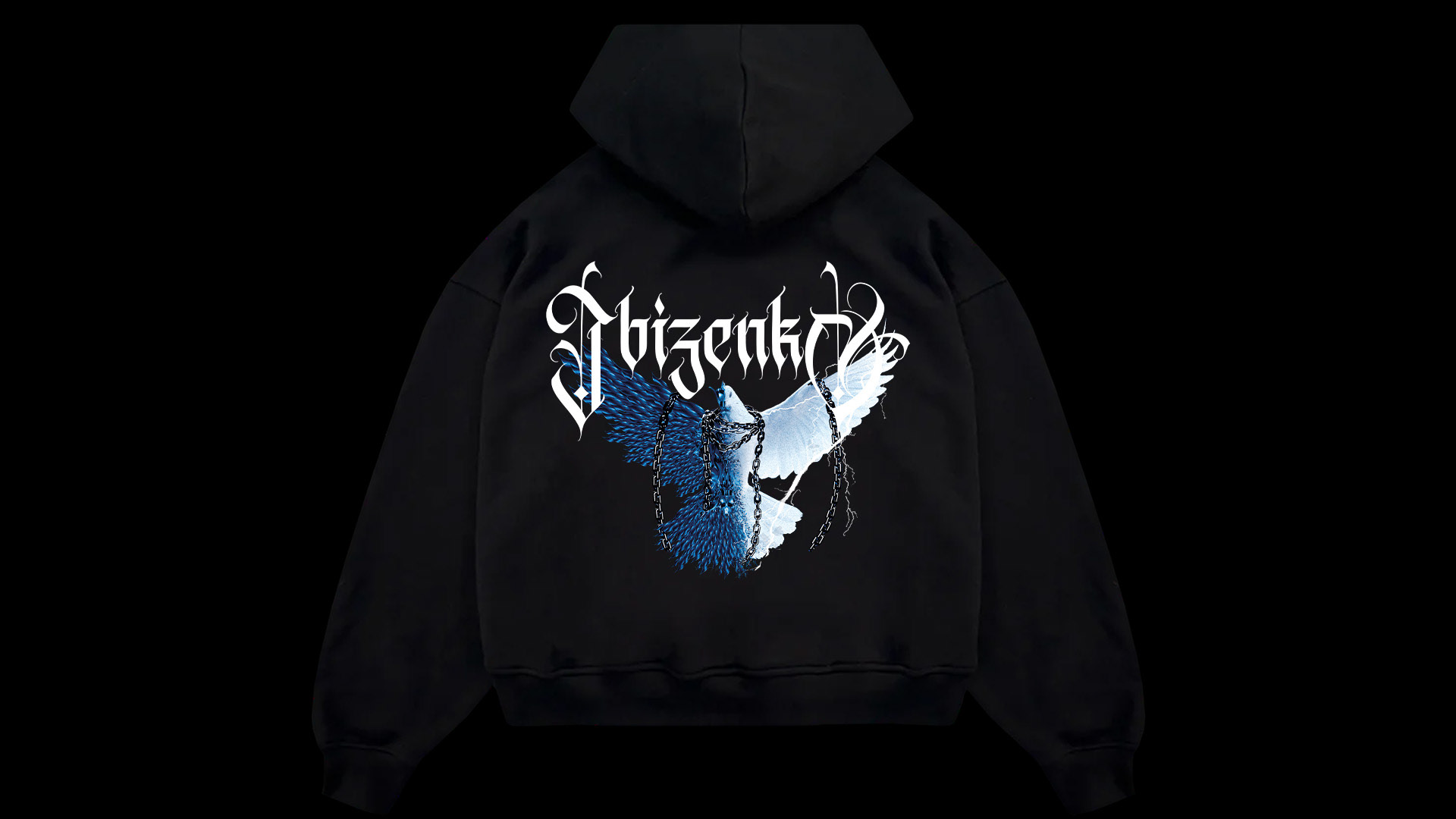
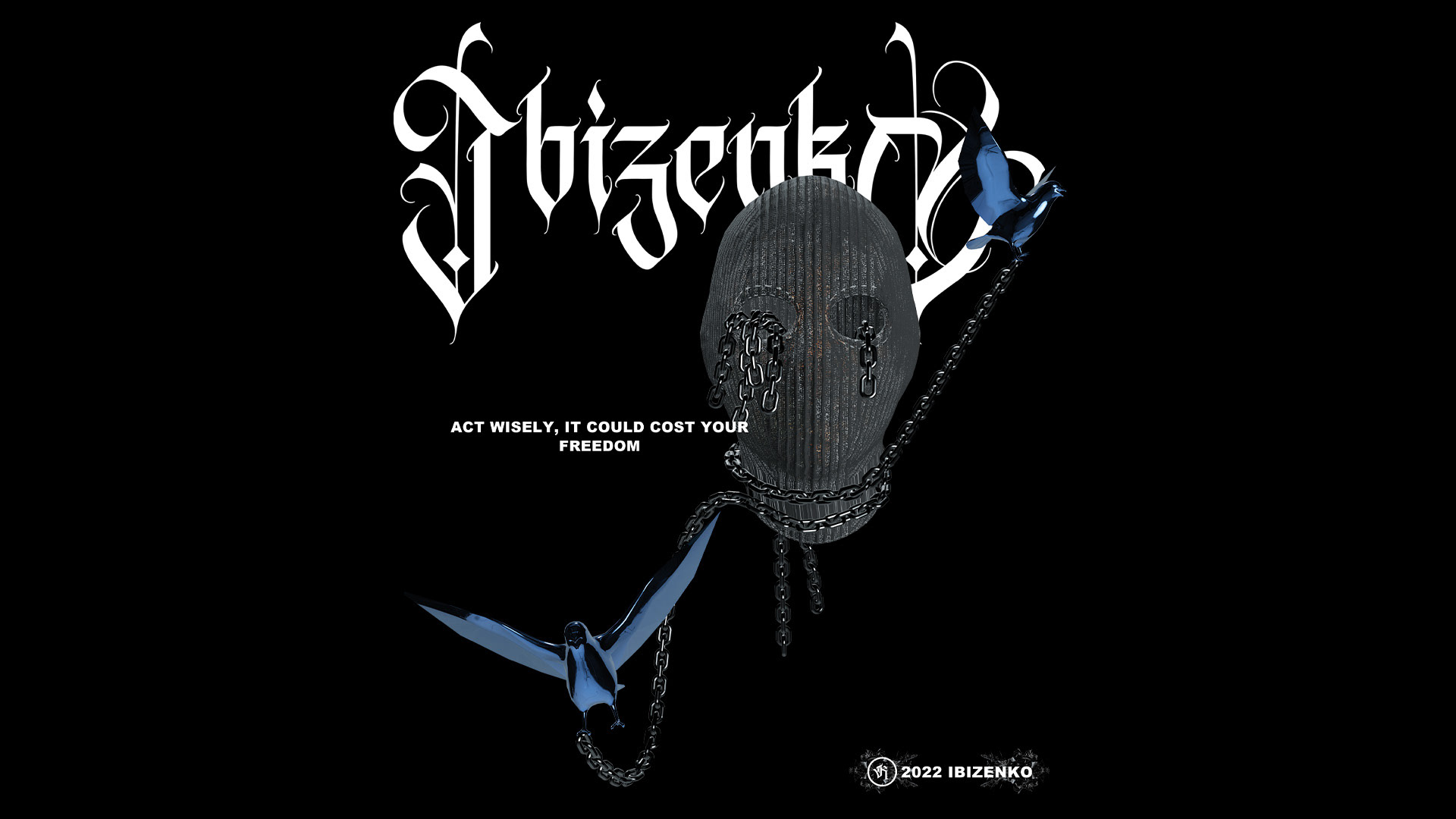
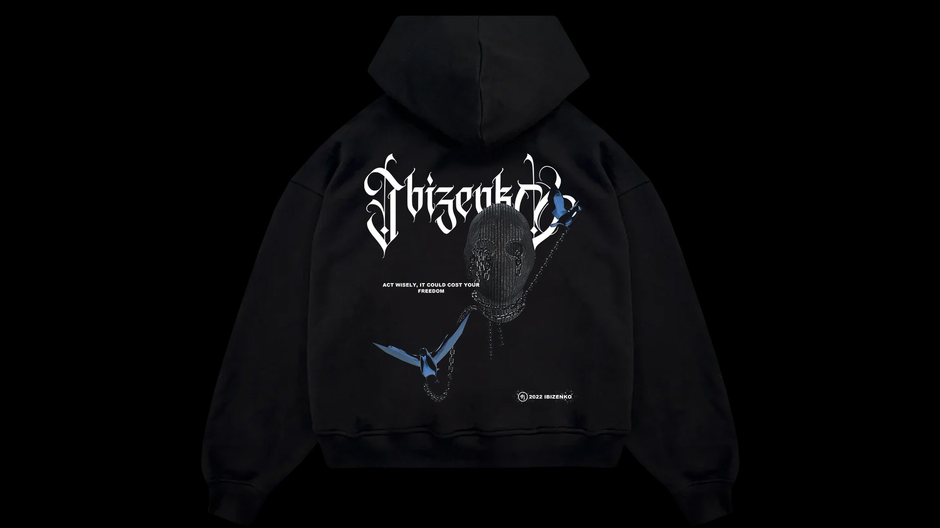
The dove was to connect all the new design approaches with the old collections.
As it was also a kind of rebranding, we tried not to find completely new approaches. Instead, we tried to retain part of the old corporate identity
The dove was to connect all the new design approaches with the old collections.
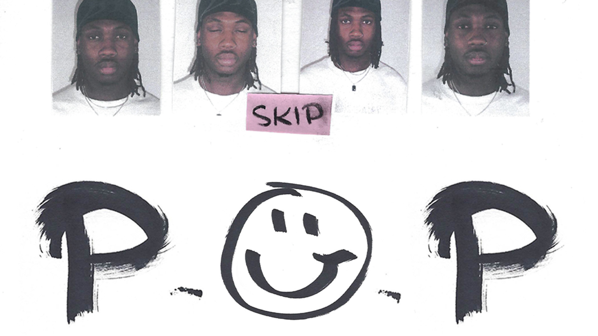
photos by : @whiteshoottaa @rene.bade
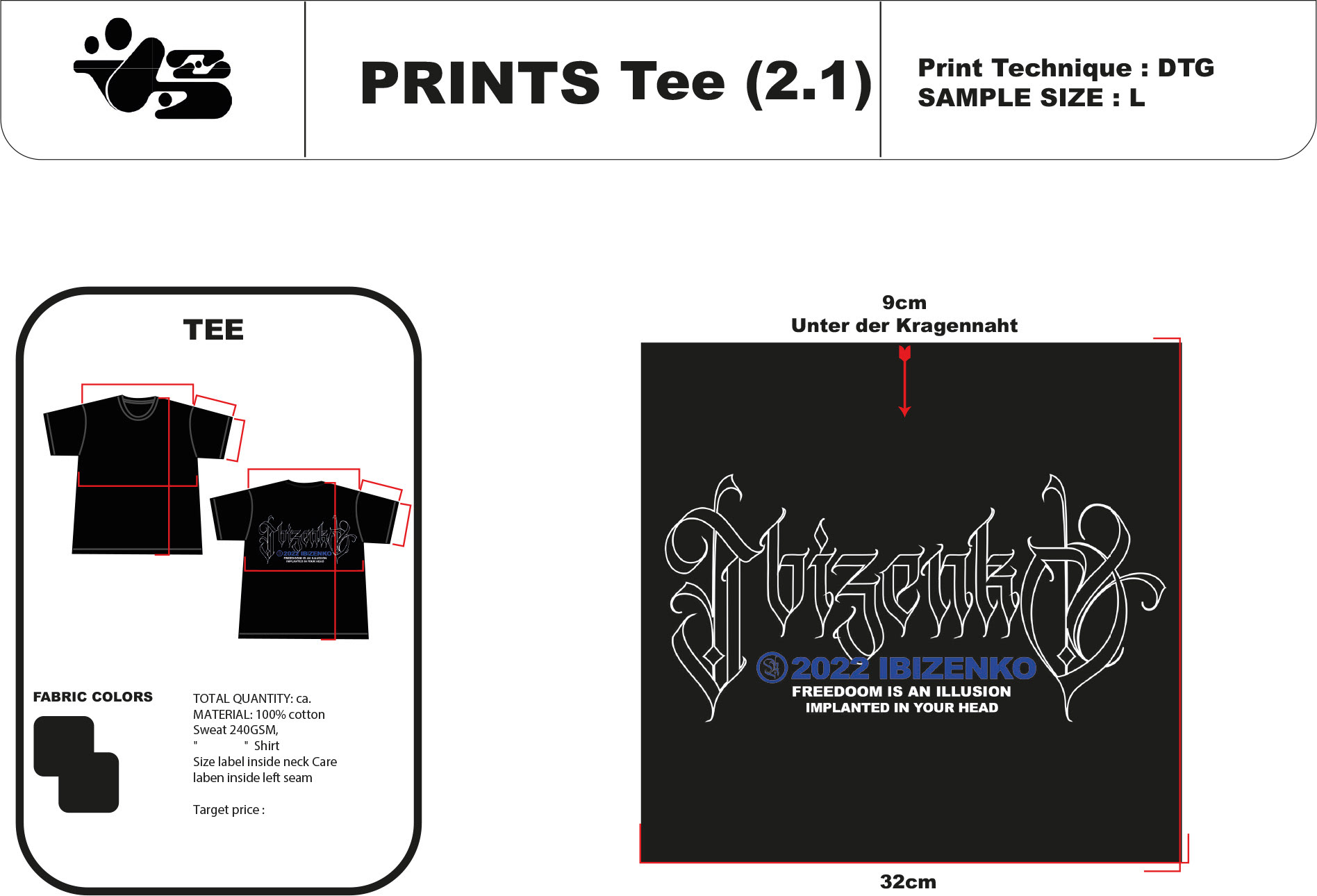
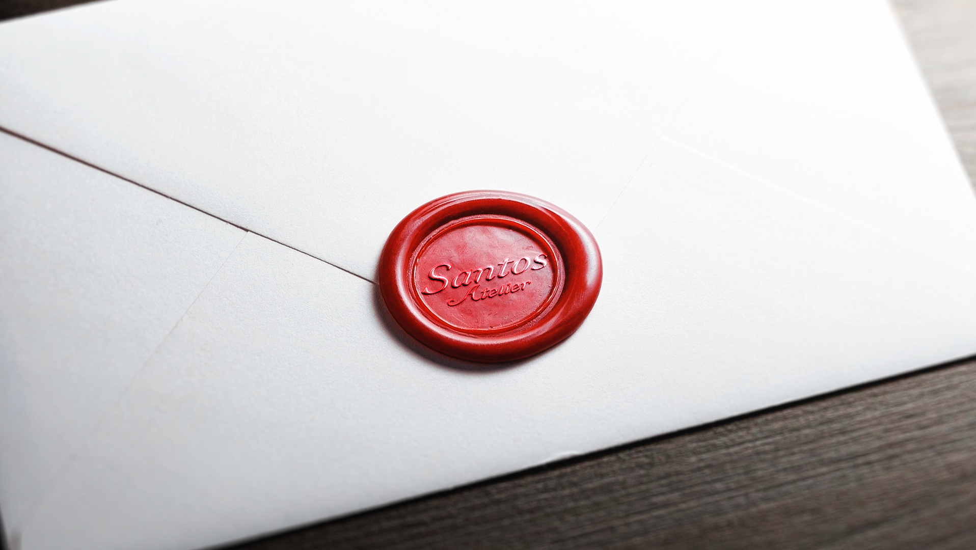
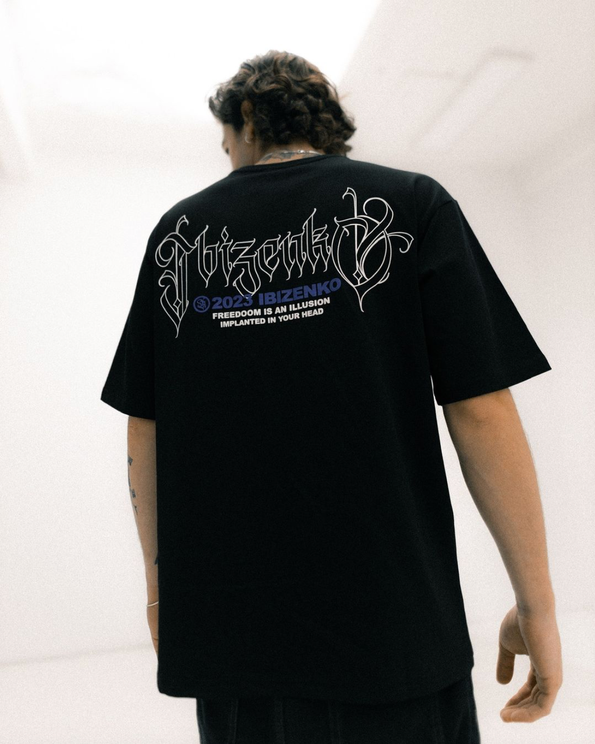
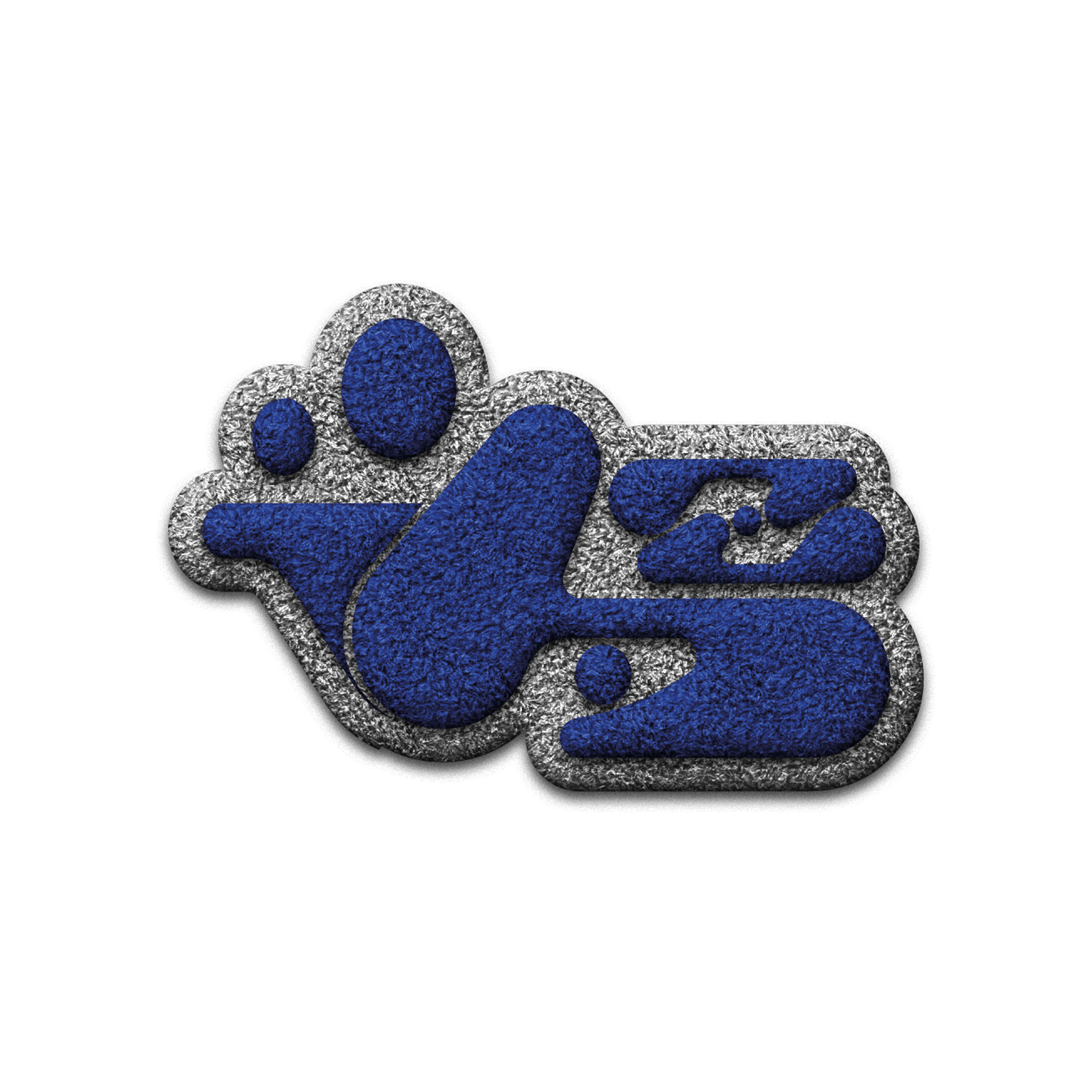
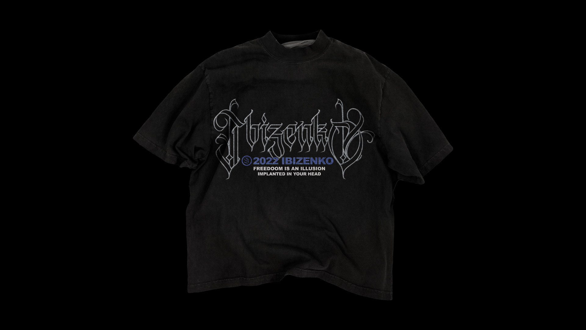
LOGO DESIGN (EMBROIDERY TEXT STYLE EFFECT)

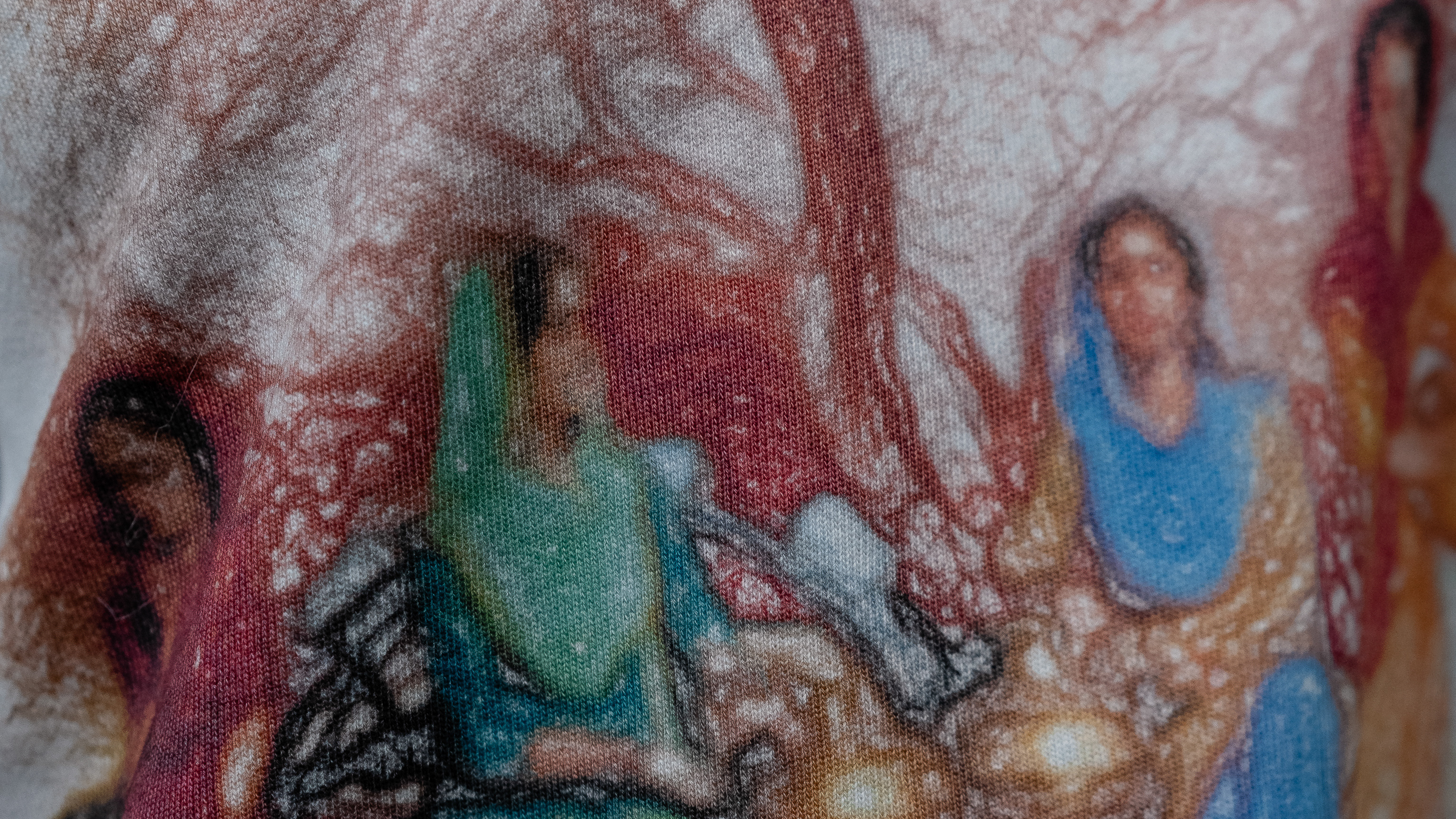
PICTURES CREDIT @IBIZENKO.DE (IG)

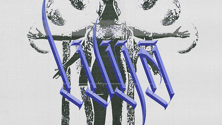
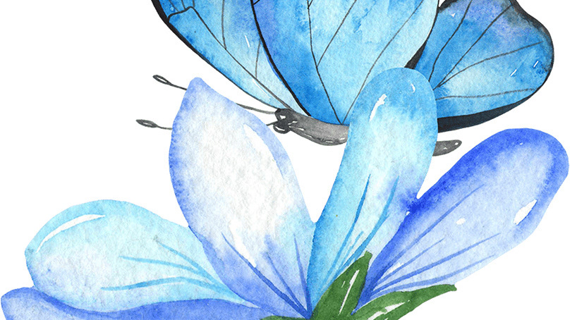
DESIGNS + MOCKUPS


3 COLOR SEPERATION

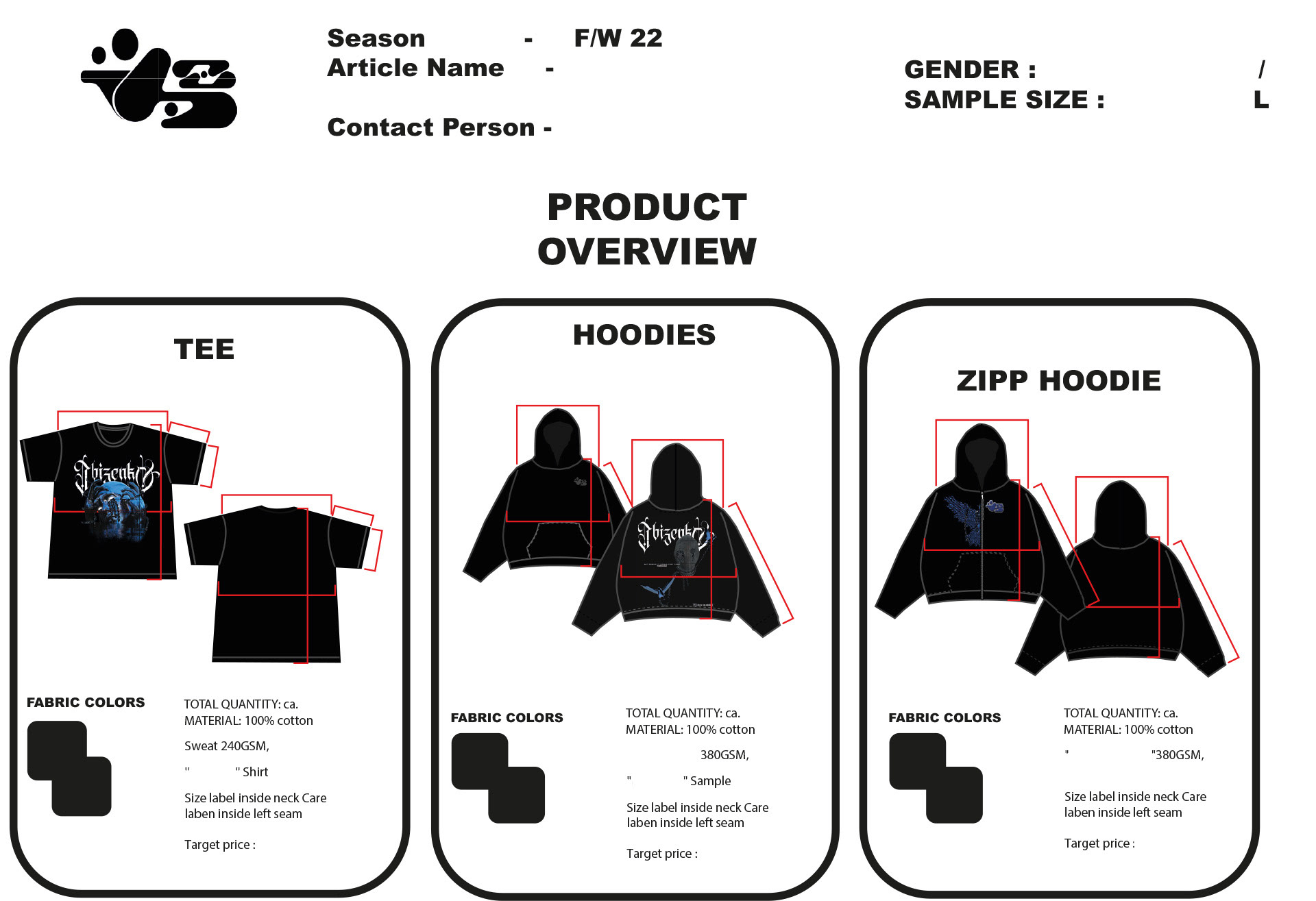
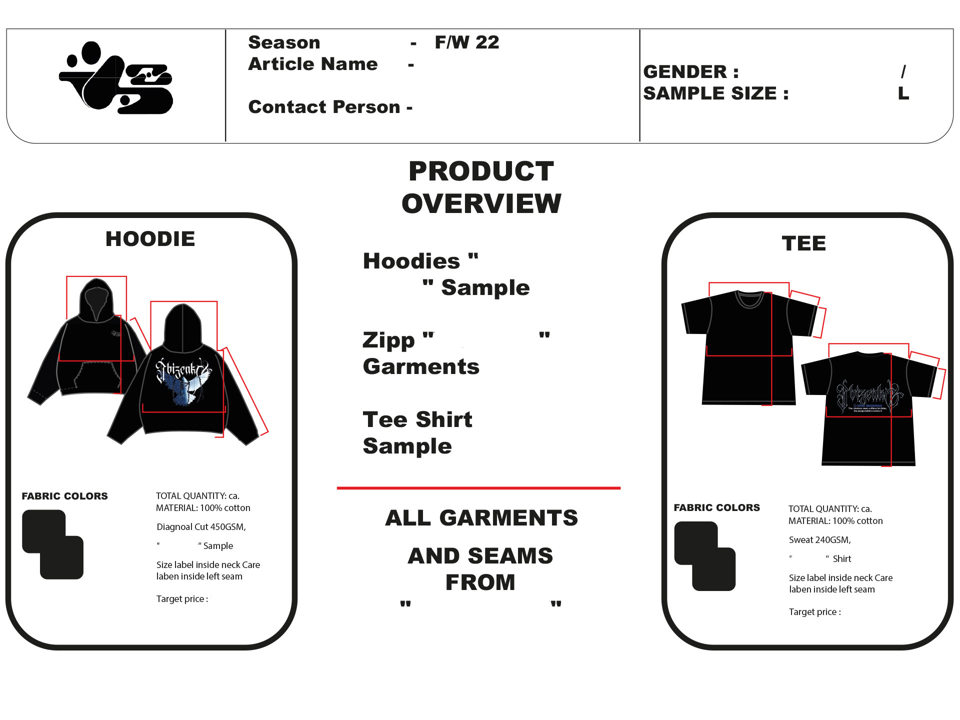
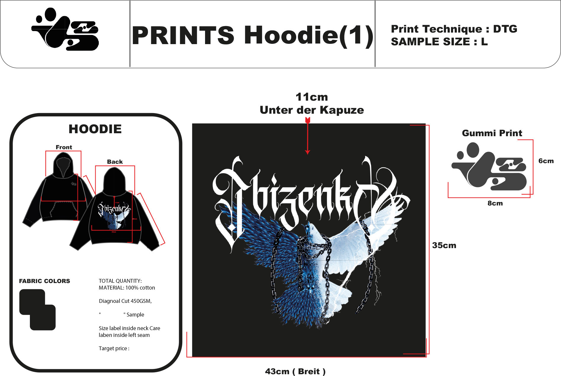
TECHPACKS